Color is Emotion: A Soul-Nourishing Creative Practice
Jul 30, 2025🎨 Color is Emotion
Color is emotion in visual form. Each hue carries a feeling, a memory, a whisper of something deeper. When you choose colors intuitively — based on how you're feeling, not just what looks “right” — you give your emotions a voice.
Instead of reaching for what’s expected, reach for what resonates. If you're feeling peaceful, maybe soft blues or sage greens call to you. If you're angry, maybe bold reds or harsh black lines want space on the page. Let the palette reflect your heart. Trust that your emotional state can guide your color choices, even if it surprises you.
🌈 Unexpected Colors & Their Emotional Tones
These colors aren’t your basic rainbow — they’re rich, layered, and full of story:
| Color Name | Emotional Tone | Notes & Associations |
|---|---|---|
| Ochre | Grounded, wise, ancestral | Earth, memory, time-worn stories |
| Indigo | Deep thought, grief, spiritual mystery | Night, intuition, shadow work |
| Sage | Calm clarity, gentle healing | Rest, reflection, inner peace |
| Coral | Playful vulnerability, social warmth | Friendly joy, soft energy |
| Charcoal | Protection, strength, contemplation | Boundary, resilience, depth |
| Plum | Quiet power, emotional richness | Royalty, mystery, inner knowing |
| Teal | Balance, renewal, emotional steadiness | Heart & mind in harmony |
| Mustard | Unconventional courage, bold intention | Vintage joy, brave choices |
| Dusty Rose | Nostalgia, tenderness, sacred softness | Feminine strength, memory |
| Terracotta | Rootedness, creativity, embodied life | Clay, warmth, connection to the land |
🎨 Soul-Nourishing Creative Exercise: Color My Emotion
Here’s a creative and gentle way to release, reflect, and restore.
🌀 Part 1: Pause & Notice
Take a few deep breaths.
Ask yourself:
-
What emotion is sitting with me today?
-
Where do I feel it in my body?
-
If it had a color… what would it be?
Write down a few thoughts without judgment.
🎨 Part 2: Choose Uncommon Colors
Resist the urge to reach for your usual favorites.
Instead, choose 2–4 colors from the emotional guide above (or your own intuition) that match or contrast how you feel.
Examples:
Feeling stuck? Try Ochre and Teal
Feeling overwhelmed? Use Charcoal, Sage, and Dusty Rose
Feeling numb? Reach for Indigo and Coral
✍️ Part 3: Paint It Out
Use those colors to fill a journal page or canvas. You don’t have to draw anything specific — just respond with color, texture, and movement.
-
Use your fingers, a brush, sponge, or even paper towels.
-
Let each mark or layer represent a feeling, a memory, or a letting go.
-
Continue until you feel something shift — not until it looks done, but until you feel lighter.
💬 Part 4: Reflect & Speak Life
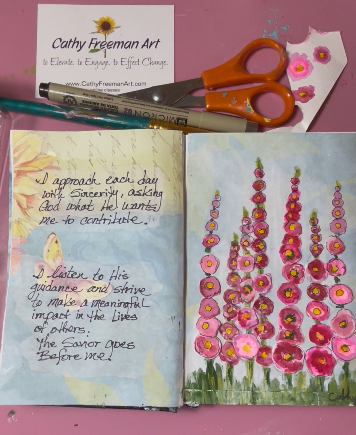
After painting, take a moment to write. I typically use affirmations from the Creative Reminders to add to my journal page. These words help to reignite my energy....they feed my soul.
Here are some questions you can ask and write about:
-
What shifted for me?
-
What might this page be saying?
-
What do I want to affirm or bless myself with?
Write a phrase, a prayer, or an encouraging word on the page — or tuck it into an envelope nearby.
💛 How This Feeds the Soul
This process gives your emotions space to breathe — without needing to explain or fix anything. When you create from emotion rather than perfection, you bypass the inner critic and let your heart be seen safely.
Each color becomes a thought, a release, or a reclaiming.
Each layer reminds you:
“I’m finding a safe place to lay down my feelings and restore my mind to something beautiful and new.”
You don’t have to carry the weight alone.
The page holds it with you.
And little by little, you feel whole again.
🖌️ I’d love to hear how this practice speaks to you. What colors have helped you most lately?